Advanced Yes/No
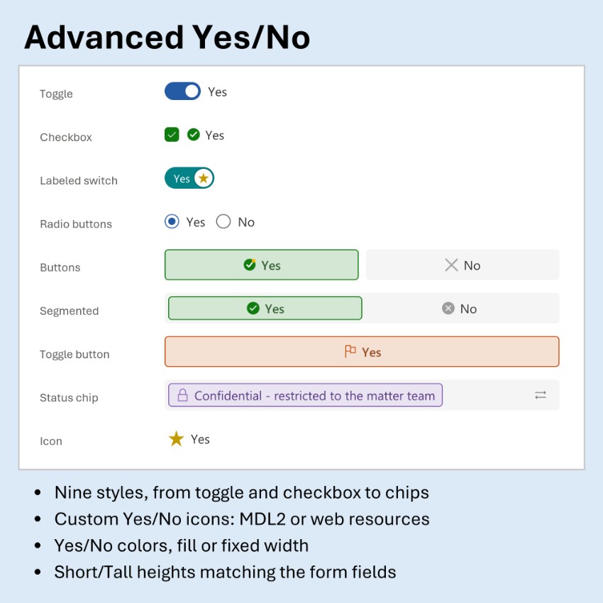
Advanced Yes/No
A control that replaces a standard Yes/No (two options) field with one of nine display styles: Toggle, Checkbox, Labeled switch, Radio buttons, two Buttons, a Segmented field, a Toggle button, a Status chip or a single Icon button. Yes/No columns have no icons or colors of their own, so the control adds them: your own Yes and No icons (MDL2 icons or image web resources) and Yes and No colors, used as they are or faded. It uses the column's own labels, fills the field or uses fixed widths, offers Short or Tall height, label and icon positions and corner shapes, and supports the keyboard and read-only. Ideal for approvals, flags such as Urgent or Confidential, and status markers.
Author: Maximilian Henkensiefken
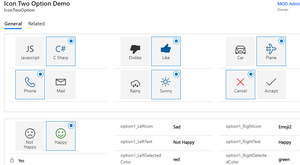
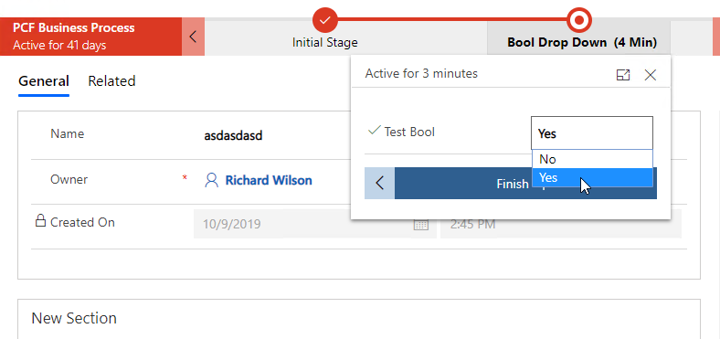
Boolean Optionset
A control to overcome limitation of Boolean Dropdown availability in Business Process forms in ce...
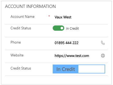
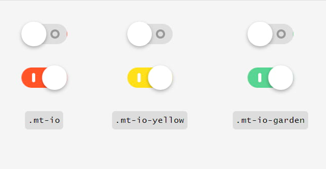
More Toggles
A control to display a Two Options field using the <a target="_blank" href="https://jnkkkk
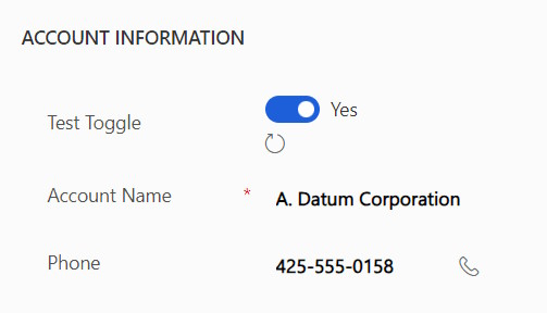
Nullable Two Option Set PCF
A control to allow users to select between three different states: Yes, No, or reset the field to...