Modern Choice Buttons

Modern Choice Buttons
A control that replaces a standard choice field with a horizontal row of clickable icon+label tiles instead of a dropdown list.
The Modern Choice Buttons Component renders one tile per option, each showing an MDL2 icon above the option's own label, wrapping automatically to a new row when there isn't enough horizontal space. It supports the same vast icon set as Advanced Dropdown - a default icon for every tile or a per-option JSON icon map, plus per-option icons sourced from each option's own External Value field.
It features independently configurable background and border color modes (a custom hex color or the choice option's own configured color), Square or Rounded tile shapes, Small/Normal/Large tile sizing, and an icon color scope that applies color to every tile or just the selected one - making it perfect for status or stage selectors, priority/severity pickers, category selection on touch-friendly forms, or any choice field where visual recognition matters more than a compact dropdown.
Author: Maximilian Henkensiefken

OptionSet Buttons
A control designed to be associated with a Choice table column, presenting each choice as a butto...
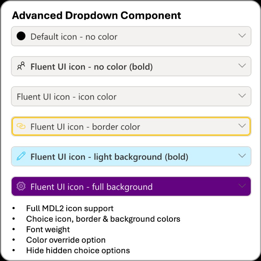
Advanced Dropdown for Choice
A control that transforms standard Power Apps choice fields into visually rich dropdowns.
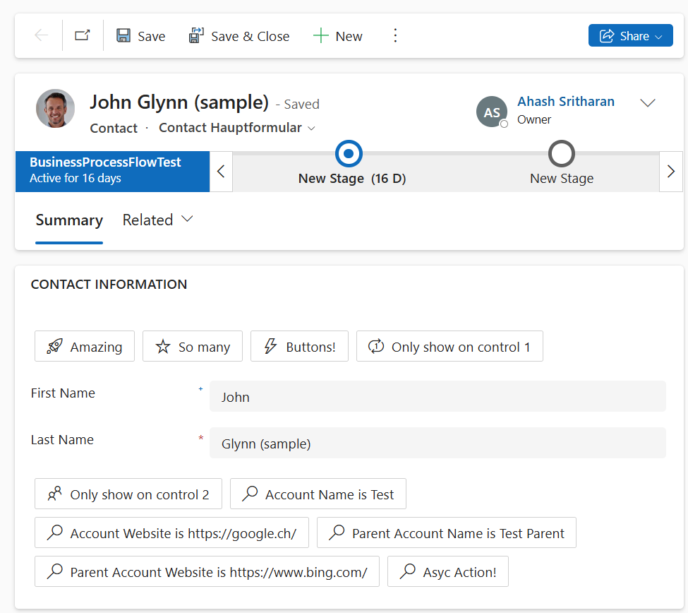
Fluent SmartButton
A control that provides dynamic, configurable buttons based on settings stored in a table
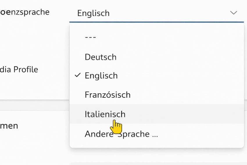
Nexplore CSV Dropdown Control
A control that renders a dropdown populated from a semicolon-separated list of values.

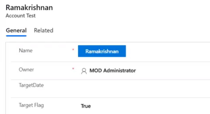
OfficeUI React Button
A control to demonstrate how to include Office UI Fabric React in a PCF control as a customizable...